CSS Border Radius Generator: Create Rounded Corners Visually
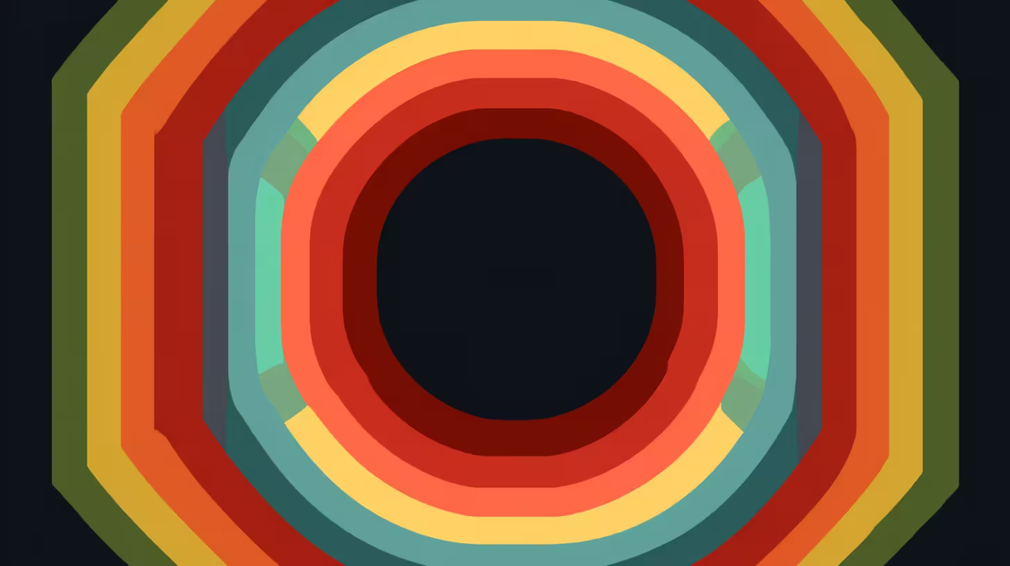
Need rounded corners on a card, button, or avatar? The CSS Border Radius Generator lets you build border-radius values visually: use one value for all corners or set each corner separately, choose px or %, and copy the CSS with one click.
Example: Pick the “Medium” preset for 8px on all corners, or “Circle” for 50% (perfect for square avatars). Use “Per corner” to round only the top (e.g. modals) or bottom (e.g. bottom sheets). Change the preview background to see the shape clearly. Copy the CSS and paste it into your stylesheet.
What is border-radius?
border-radius is a CSS property that rounds the corners of an element’s border box. You can set one value for all four corners or set each corner separately (top-left, top-right, bottom-right, bottom-left). Values can be in px (fixed size) or % (relative to the element) — 50% on a square makes a circle.
Why Use a Border Radius Generator?
Visual feedback — See the rounded shape on a preview box before copying code.
Per-corner control — Round only some corners (e.g. top-only for modals) without memorizing the four-value order.
Units — Switch between px and %; use presets like Pill (9999px) or Circle (50%) and tweak from there.
Presets — None, Small, Medium, Large, XL, Pill, Circle, Top only, Bottom only.
No sign-up — Free, client-side, and works offline once the page is loaded.
How the Tool Works
- Use the preview to see the current border radius (and optionally change the preview background).
- Choose “All corners same” for one value, or “Per corner” for four values (top-left, top-right, bottom-right, bottom-left).
- Pick unit: px or %.
- Copy the CSS from the output and paste it into your project.
- Try presets (e.g. Circle, Pill, Top only) to jump-start a style.
Syntax: one value applies to all corners; four values go clockwise from top-left.
Use Cases
Cards and panels — Slightly rounded corners (e.g. 8px) for a modern look.
Buttons — Small radius for buttons or pill shape for full-width pills.
Avatars and icons — 50% on a square element for a circle.
Modals and sheets — Rounded top corners only, or bottom only, for attached overlays.
Frequently Asked Questions
When should I use px vs %?
Use px for fixed rounding (e.g. 8px on cards). Use % when you want the radius to scale with the element — 50% on a square gives a circle; on a rectangle it gives pill-like ends.
What is a pill shape?
A pill is a rectangle with fully rounded short ends. Use a large value (e.g. 9999px) or 50% so the radius is at least half the side length, giving semicircular ends.
Try the CSS Border Radius Generator
CSS Border Radius Generator
Generate CSS border-radius values visually. Set one value for all corners or per-corner radii in px or %. Copy the CSS instantly.
The CSS Border Radius Generator is free, works in your browser, and requires no sign-up. Choose all-corners or per-corner, set px or %, try presets, and copy the CSS with one click — perfect for cards, buttons, avatars, and modals.
Related Tools
- CSS Box Shadow Generator — Create box-shadow values visually
- Gradient Generator — Create linear, radial, and conic CSS gradients
- Color Contrast Checker — Check contrast ratios for accessibility
- Font Pairing — Preview and test typography combinations