CSS Text Shadow Generator: Create Text Shadows Visually
Need depth, outline, or glow on headings and text? The CSS Text Shadow Generator lets you build text-shadow values visually: set offset, blur, and color for each shadow, add multiple shadows, and copy the CSS with one click.
Example: Choose the “Soft” preset for a subtle drop shadow, or “Glow” for a zero-offset blur. Use “Outline” for a crisp outline effect, or “Layered” for a more realistic shadow. Change the preview text and colors to see the effect on your copy. Copy the CSS and paste it into your stylesheet.
What is text-shadow?
text-shadow is a CSS property that draws one or more shadows behind text. You set the horizontal and vertical offset, blur radius, and color. Unlike box-shadow, text-shadow has no spread or inset — just offset, blur, and color. Multiple shadows are comma-separated and stack in order.
Why Use a Text Shadow Generator?
Visual feedback — See the shadow on sample text (and your own preview text) before copying code.
Multiple shadows — Add several shadows for layered depth or combine outline and glow in one declaration.
Presets — Start from None, Soft, Medium, Hard, Outline, Glow, or Layered and tweak from there.
Preview controls — Edit preview text and text/background colors to test readability and contrast.
No sign-up — Free, client-side, and works offline once the page is loaded.
How the Tool Works
- Use the preview to see the current text shadow on sample text (edit the text and colors if you like).
- Edit each shadow: offset X/Y, blur, and color (picker or hex/rgba, including transparency).
- Add or remove shadows to build layered or combined effects.
- Copy the CSS from the output and paste it into your project.
- Try presets (e.g. Glow, Outline, Layered) to jump-start a style.
Syntax: text-shadow: offset-x offset-y blur-radius color; Multiple shadows are comma-separated.
Use Cases
Headings and titles — Soft shadow for depth or readability on busy backgrounds.
Outline effect — Small offset with no blur (or multiple shadows) to suggest an outline.
Glow — Zero offset with large blur and semi-transparent color.
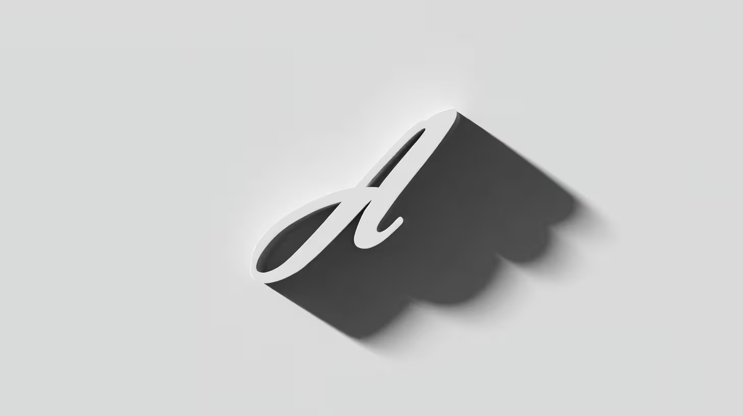
Layered depth — Multiple shadows for a more realistic drop shadow.
Frequently Asked Questions
How is text-shadow different from box-shadow?
text-shadow applies only to text and has no spread or inset — only offset-x, offset-y, blur, and color. box-shadow applies to the element’s box and supports spread and inset. Use text-shadow for typography effects and box-shadow for containers and cards.Can I use multiple shadows?
Yes. Add more shadows with “Add shadow.” They stack in order; the first is on top. Use multiple shadows for layered depth or to combine outline and glow.
Try the CSS Text Shadow Generator
CSS Text Shadow Generator
Generate CSS text-shadow values visually. Set offset, blur, and color. Add multiple shadows and copy the CSS instantly.
The CSS Text Shadow Generator is free, works in your browser, and requires no sign-up. Set offset, blur, and color, add multiple shadows if you like, and copy the CSS with one click — perfect for headings, outlines, and glow effects.
Related Tools
- CSS Box Shadow Generator — Create box-shadow values for cards and panels
- CSS Border Radius Generator — Create border-radius values visually
- Gradient Generator — Create linear, radial, and conic CSS gradients
- Font Pairing — Preview and test typography combinations